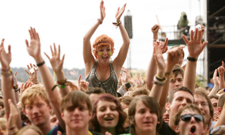
Who Would Be The Audience For Your Music Magazine?
The ideal reader of my magazine would be a male in his early twenties, possibly studying music at university or taking music related internship/job. They would live in a reasonably built up area and would be very sociable, this would lead them to be very up to date with the latest social networking trends. An ideal night out for him would involve going to see an act like Kings of Leon or Arctic monkeys live or going to see an upcoming rock/indie band. In his spare time he’ll check out new music online or watch music channels such as Qand Kerrang. Music will be a very big part of his life and therefore he will always have his I-Pod at hand. He will always be on the lookout for new bands to get into and local gigs he can go to. His I-pod will have artists like: Kings Of Leon, The Kooks, Artic monkeys, Biffy Clyro, A Day To Remember, Foo Fighters, Paramore, Green Day, Blink-182 and many more similar artists. As well as reading music magazines, he is reading online articles on his favourite bands and has autobiographies on them. Typical clothes he will wear will come from shops like Topman, River Island and similar shops. He will also be interested in local music but also in international music. The target audience I have chosen for my music magazine is from the ages of 16-34.I have chosen this particular age group as it is beginning from the age where young people will start to earn their own money and get a job, therefore my magazine will be affordable for them, it is also at an age where teenagers will begin to have a passion for music and have a strong idea about their interests and dislikes. Anybody younger than my target audience will not yet have achieved a strong passion for a particular music genre as they will still be learning about the different types of music there is. Also, they might not have the money. My magazine appeals to both males and females, as it is not based on a particular gender. Depending on who the feature artist is, I feel men and women's interest in a magazine can change. However, in general, my magazine is going to have articles that appeal to both genders. My music magazine will be mainly aimed at the A B C1 social category as these will be the people most likely to spend money on my magazine. Psychographically my target audience will be achievers as they will have successful lives, allowing them to enjoy their hobbies and passions – in this case music. Because of this, they will also be also be pleasure seekers as they will have the money to spend in activities they enjoy. Although they are successful and have enough money to afford my magazine, my target audience might also be joiners, this is displayed in the way they would buy my music magazine, to read about people of a higher status and class than them, with the hope that they might also be able to achieve this. Demographically my target audience will live in busy cities or towns, leading hectic lives, either with a job/education or both. Therefore, my magazine will be used for the uses and gratifications theory of escapism, as the reader will want to explore a different world than their own.
How does your media product represent particular social groups?
I have represented a social group in which image is highly regarded among members and is everything. Young people are highly defined by music which they predominantly form these social groups on which then lead to sub social groups. The sheer importance of live music to this subculture demonstrated through the festival and gig scene is vindictive to the ritualistic activities that lead members to be around like minded people. This means that by having and indie-rock magazine that the image of my models and the appearance they give to an audience is what is going to be the biggest selling point of my magazine. In order to do this I have chosen a model which portrays the look of an indie culture musician. Being part of the Indie culture social group she was perfect for the part as her style was already what I wanted and little needed to be altered about her appearance.
The shorter hair looks very stylish but still is that bit different from a typical pop culture musician with long hair clad with extensions and managers to give a bit more of a rocker/Indie vibe. Another reason I have chosen her is that with Indie models typically look very natural and show a very real beauty unlike that of a pop culture in which artist are heavily covered in makeup and highly photo shopped. Therefore by having a model that has a natural beauty with minimalistic makeup makes her appear more real to fans and relate to the culture that both her and readers of my magazine live by. I had several other choices in models that I was tempted to use however I used research into Indie culture to determine that she would be the best suited for the role. Also another minor factor into my model was that she has a very peculiar but interesting green blue eye colour that really works well in close up shots and captures the attention of a reader quite well.
I used the U.S.A flag to incorporate into my main article on her trying to make it big in America. This is used to reinforce her image and give an initial concept of what I intend to be featured in the magazine article. Also the shorts are of a style of clothing that is typically worn by girls of the Indie culture social group. I know this through personal knowledge and also through research done into Indie culture. The thick rimmed glasses are a very recent and modern style. Especially found within the Indie social group and sub cultures. This is because they are seen as very different and slightly geeky in an independent way that typical indie fans find fitting. Not used for vision improvement but as a fashion accessory I have equipped my model with them as to give off the cool/geeky independent look that they have become known for. Over recent years skinny jeans have become all the fashion with the younger generation that my magazine intends to target. They have also made a large impact on the rock and indie industry as being known as a very ‘rock’ look. It is a look that has been recycled from the 50’s. In which they were worn by country stars and of those artists at the birth of ‘rock and roll’. This makes them a fitting and stylish piece of clothing for my model to be wearing. Converses canvas shoes are a typical foot wear seen worn by many of the younger generation. Also to have them worn out is considered a fashionable thing amount the cultural society of indie members. Throughout my research there was one main noticeable re occurring item of clothing worn by girls of the Indie culture that my model needed to represent. This was a fur hat as shown. For this reason I have heavily incorporated it into my models dress as to form a link and allow an audience to identify with her. I also incorporated a denim jacket into my models appearance as have been a recent style very popular amongst the Indie culture. However I feel that the slightly faded style denim appeals allot more to an Indie culture as it looks a bit worn and real rather than a darker clean denim which would look unused and give off a appearance of a artist who is higher above and different to their fans in always having new clothes. The knitted jumper with the giraffe she is wearing in some of the location shoots is a very different and interesting piece of clothing. It has the knitted style that becomes popular with young people in my social group in the winter seasons. This means it is an ideal piece to use in my magazine which is going too published in late September just as the winter season is coming. Also the giraffe on it is very different and an abnormal design that you would see on a typical piece of clothing. This gives it the independent and non conforming look that Indie artists tend to go for in its self paradoxically leading them to conform to their cultures stylisation.
There have also been styles that I have highly avoided to ensure that my model is a clear and relatable Indie star and that she does not get blurred with other cultures. I have avoided dressing her in very glamorous dresses and outfits as well as the very in style jumpsuit as this is allot more highly regarded with pop culture and would blur and distort her identity negatively. I also have avoided her overly wearing the colour black and wearing any conflicting rock and metal band t-shirts that you typically find with metal artists. This to ensure that she is not seen to be metal/goth/emo or any other variations of these sub cultures. Being an Indie and rock magazine I do also cover rock music. However I have avoided overly portraying her as a rock star as she is predominantly an Indie musician and to have a clear identity is a key feature in making a presentable image that works.
In choosing the locations for my outdoors photo shoots I took several things into consideration. Being Indie culture I took into consideration the festival scene in the social groups. In which it is highly regarded and ritualistic to those most in depth in the culture. For this reason I decided to make the majority of my shoots reasonably natural. The only man made urbanised scenery in my shoots was typically run down and at natures will giving it that slightly shabby and ‘in’ look. I also tried to portray a slightly ‘old school’ and faded colouring in my shoots. This relates to the rest of the Indie culture from clothing to style of music. I also wanted to avoid highly urbanised and bright locations as I felt this would give off more of a pop culture appearance.
Each prop I have used in my photo shoots has been carefully thought out and selected in order to enforce her image as a normal indie girl who hit the big time and be relatable to the cultural social group she represents. I have incorporated several different guitars into my photo shoots as guitars are a key and iconic piece of the music industry, especially within the Indie scene and are played by a high number of this social group. Therefore by having my model able to play the guitar it makes her more than just a voice and an actual musician of the cultural Indie music.
As with every singer the key piece of iconography is the microphone they use to sing with. For this reason it is only fitting that I have incorporated into my models look. The microphone with the long wire is known allot more within the music preferred by younger generations to that of older there for making it appropriate for my target Indie social group which is predominantly the young.
Another thing I did to incorporate my model into the Indie scene was to re brand her as ‘Georgia and the Sparrows’. I did this because a typical indie branding is to do such a thing and add a ‘and the’ followed by a noun onto the singers name. For example ‘Florence and the Machine’ or ‘Marina and the Diamonds’
Finally in the magazine article itself I have deliberately used her language and references to portray her in depth involvement in the Indie culture and give her the desired appearance of the typical every day Indie girl who hit the big time. I did this by ensuring that she had a fun conversational tone and language that was the same as used in the Indie social group. I also told stories of her past and how she came to fame demonstrating how she was just an average run of the mill Indie girl who that of the Indie culture can relate to. I also told stories of fun and adventures that were not exactly rule abiding and conforming that portrayed her as fun and youthful up for a bit of adventure as these social members would be. When I talked about who she would want to perform collaborations with I did two things that are coming a typical thing to find on the Indie scene. The first of was typically naming other Rock and Indie bands that she would be interested in working with demonstrating that she was a clear part of the Indie culture. The other thing I did which is allot more recent in the Indie scene is the cross genre collaboration of the Indie singer or band and that of maybe a pop or hip-hop artist. For example when Florence and the Machine when they collaborated with Dizzie Rascal. By doing this I have demonstrated that she follows typical Indie culture conventions and is a true Indie artist.
This is a full evaluation of my final magazine product. I have created it on powerpoint then hosted it using scribd. I also have submitted all of the evaluation in text format below. Full Magazine Evaluation
Front Cover
The masthead I have used is very fluent and connected which is used to represent the fluency of the music it is presenting to the audience. It also symbolises connection between the magazine and the audience representing that this is a place where one can feel at home. The baking shadow is used to make the masthead a bit bolder whilst keeping the feel the connected letter effect gives and draws the attention for those looking to find their favourite magazine. I have also chosen the name unplugged for my magazine as this evokes that my magazine has not conformed to the way it may be wanted to appear and therefore it is allot more real and people are getting the full story from behind the lights and stage once everything has been unplugged.
The medium close up shot I have used for my full bleed image is used to draw the attention to my magazine. The lighting effects I have used bring a reader in so that it will stand out in a shop to a potential buyer. By having my models eyes directly contacting the camera it allows a reader to feel that she is looking at that person in particular which makes the magazine experience feel more personal and helps with the uses and gratifications theory of escapism.
In the Foo Fighters sell line the layer effect I have used added with the drop shadow of the shapes causes it to appear more 3D to an audience which in turn allows the magazine to feel more realistic in a reader’s world. In the winters top concerts sell line is set up with one of the key words top in a larger red font where as the rest is in black. This emphasises to a reader that these are the best concerts and something that they need to find out about in which they can only do in buying the magazine.
In my bottom sell line I have introduced a circle joining a rectangle shape which will be recognised on each front cover enforcing my brands identity and giving a re-occurring feature that an audience will come back for. As for the sell line itself I have enlarged the 10 as this immediately tells an audience that this is a list and recommendation that allot of readers will look for in a magazine as they like to know what is in at the moment as this allows them to be able to socialise about it with friends
The top pull quote offers an insight into the different kinds of articles one will find when reading my magazine. The interchanging colours red and black signify the diversity between types of articles from interviews to gig guides and that a reader will experience everything they could want out of my magazine.
The use of the slogan ‘Unplug from the world’ is used to create a brand identity with my magazine by being in the same place above the masthead each time. The play on words with the masthead evoke that this magazine will help you to escape into the world of indie and rock music as one purchasing this magazine would look to do so.
The main plug sell line has been put into a bubble to bring extra attention to it above other sell lines as this is the article that this month’s copy is selling my magazine predominantly on. Also the American flag backing is used to visual tell what the article will be about before reading it.
In the next two sell lines I have mimicked the one on the other side. This is to cause my magazine to appear organised which will encourage readers to have a higher level of trust in the reliability and authenticity of the content I produce inside. Yet again I have enlarged the No and Death as these are bold powerful words that can draw a reader’s attention into wanting to know more about what is going on.
I have then left the background white which gives my magazine a level of clarity and simplicity that highlights that while being complex in the amount of articles and content it is simple and easy to navigate like a reader would look for in a magazine.
The barcode is used to allow me to retail my magazine in shops as typical with all magazines. I have included the date and issue number so that an audience can differentiate it from previous issues and know when a new issue has been released.
Next I have given the web address to my magazine as this allows me to receive interest in my magazine through different forms of media and for people to access my content in different ways. It also makes my magazine more trust worthy as to an audience a magazine with a website has a more professional feel to it. I have given prices for my magazine in three of the main world currencies in order to have a global audience
Contents Page
The use of the extra images allows me to give a visual of other articles apart from my main one in my magazine. This can draw attention to a reader who could recognise a favourite artist who they can then find by the clear letters next to them.
It was important to also include the date and issue number in my contents page as to keep up a common appearance throughout my magazine that a common reader will recognise. Next I have given the web address to my magazine as this allows me to receive interest in my magazine through different forms of media and for people to access my content in different ways. I have also decided to include the common zeitgeist of social networking by offering a twitter and facebook page that readers can use to access extra content and contact the magazine.
The ‘bands inside’ plug has been used to allow a reader to easily search for bands they are interested in and then locate them in the magazine. The black and red colour scheme stands out making them eye catching and appealing whilst the grey page number is clear and gives an easy direction to the correct page.
The main image of my contents page is of my main article. I have pretty much centrally orientated it as this is the main attraction to this week’s issue and what allot of readers will be reading for. I used a location shoot and kept it squared shape as this causes the picture to be bold and stand out as well as looking very organised and professional. I have then used a very similar sell line as to the front cover in order to make it recognisable to those who have brought the magazine predominantly to read this article. I have then made this page number the biggest and clearest as a key feature of my magazine being successful will be clearly being able to find this article. I then included several lines of text underneath in order to further clarify what this article is about without having to read it. Next I have given a large space of my contents page to a plug encouraging people to subscribe to me magazine. I have made this black and white making it simple and clear. I created several quick front covers in order to give my magazine the appearance of a real magazine with monthly releases. Subscribe is in a larger font as I intend to use the imperative to command people into doing so. This is also squared to appear professional.
I have decided to go against typical magazine conventions of actually heading my contents page as ‘contents’. Instead I have named it ‘Inside Unplugged’ which gives the magazine a friendlier and personal feel that my readers can connect to rather than the overly formal ‘contents’. I have used the same font for unplugged as with my masthead in order to keep up the professional identity of my magazine. However I have used the magazine font of impact as this makes it clear and gives off the organised and professional appearance of all being the same.
Next I have given three main headers to my articles in order to give them a form of grouping system that will allow a reader to locate the articles that they are looking for much more easily. Within these groups I have listed articles relating to them. First of all I have listed the article titles in bold black capitals. This makes the reader initially focus on this and allowing them to decide if this could be a piece that they are interested in. Upon deciding if this would be something that they are considering reading I have given a few lines of a fainter gray in lower case that they can read in order to make a final decision upon going to this article. I have given them this fainter colour and lower case text as they are not the key part of the article and not what I want my audience to predominantly focus on but to sub focus on in order to back up the initial title. Finally I have used the red of my colour scheme to offer page numbers to the articles. This makes them clear and stands out against the darker colours offering clarity to a reader in how to navigate the magazine. I have also given little space between the lines making all the pieces quite grouped making them that bit simpler and appealing. This is still ok to differ between articles thanks to the different colourings.
Finally I have created a small plug offering my alternate ways to view my magazine. Although it is probably too late for them to do after purchasing this hard copy it will give them future knowledge of alternate sources for future issues. I have targeted the two dominants of the e-book market in Ipad and Kindle. This allows me to reach the majority of this field making them aware of ways they can get my magazine without even having to leave home. I have enlarged and coloured red the words ‘Ipad’ and ‘Kindle’ as these are key flash words that a reader will spot and immediately have a sense of the topic of the plug. This makes it a quick and simple process that doesn't interrupt a reader’s magazine experience.
Double Page Spreads
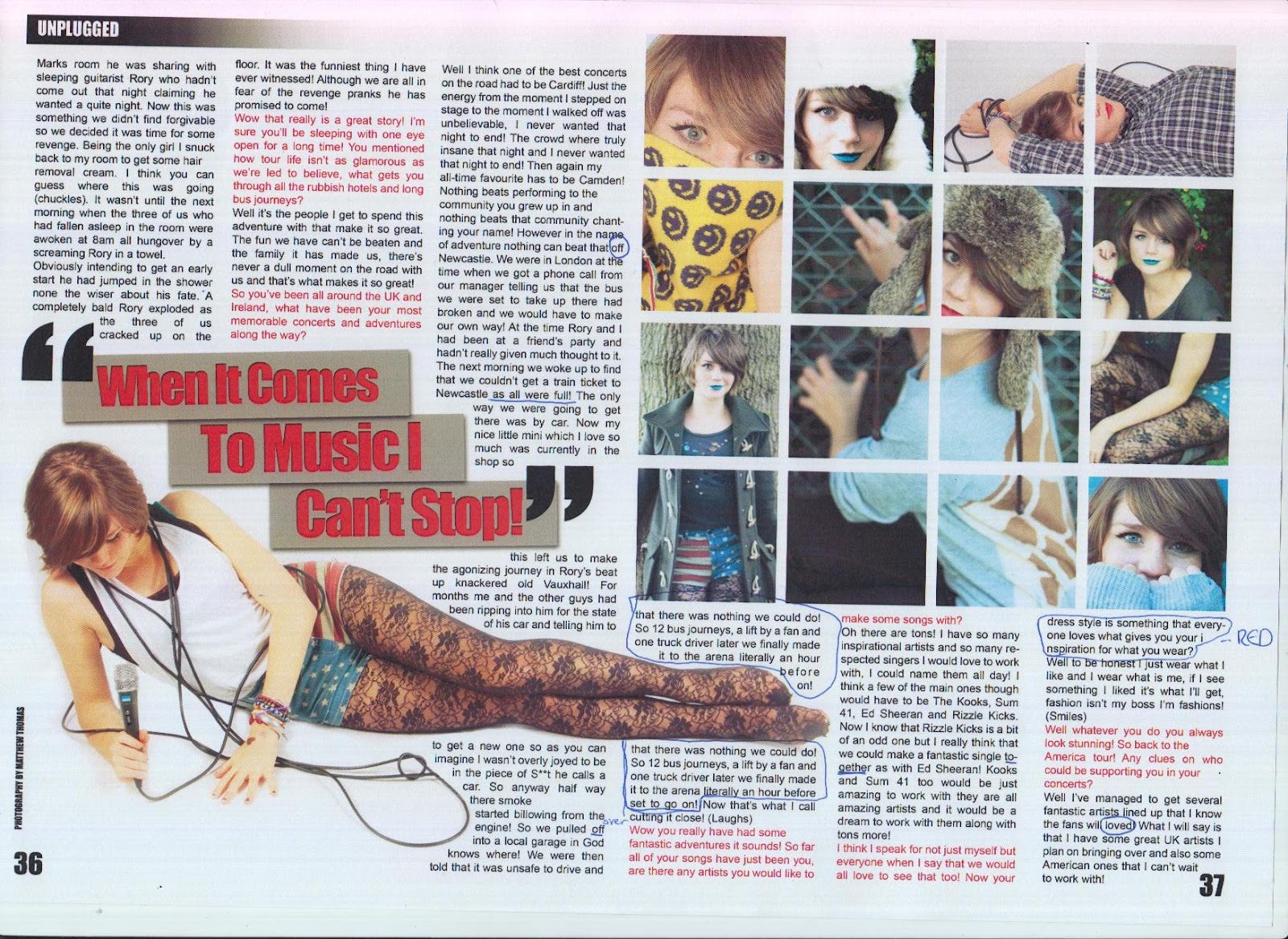
For my first double page spread I decided to give a more visual display than informative in order to initially catch the reader’s attention. To do this I devoted the first page entirely to one of the best pictures of my model. I also gave the picture a black and white effect. The visual effect this has on the double page spread is a huge impact and really draws a reader into the magazine. By being a medium close up in which she is looking off into the distance in the direction of the next double page spread evokes that there is allot more to come that you have to continue to find out about. I then put a full body picture across the top for appearance purposes. I have made the first page number of the article a lot bigger than the others. I have decided that this will be re occurring style throughout my magazine as it allows readers to spot the beginning of an article easily and when using the contents page to find a piece it allows the reader to navigate allot more simply. I have then once again added in the web address for my site as I am still aiming for readers to go on in search of more music stories and information. As with every magazine I have followed the typical convention of including a small caption naming the photographer who took the pictures. Another convention I have followed is using the re occurring header of my magazine name ‘Unplugged’ at the top of each page. The use of putting it all in banner type rectangles creates a very formal and organised appearance finished off with a fade effect for aesthetic purposes. Finally the big pull quote is used to draw attention to what is yet to come in the article and capture a reader’s interest into continuing further on into it. On the next double page spread I have filled the first half with another one of my pictures in black and white, this will initially catch a reader’s attention and lead them to turn to the other page for the article. I have started it off with another large pull quote which builds on a reader’s curiosity. Next I have followed a convention that some magazines and newspapers tend to use in putting the introduction to my article in a slightly bigger font so that a reader can get a taste of what the article is about before getting into the longer smaller text columns. I have continued to include the same format with page numbers, headers and photography caption in order to continue my magazines identity and appear professional. I have also ensured to keep up my black red and white colour scheme to keep up its identity. In the next double page spread I have then continued to follow my magazines identity and keep up the appearance. I then decided to create a box grid of windows in which I could include a variety of my photos as it is important to include a strong visual appearance as this is the main thing that will get the attention of a reader. The next pull quote I have used I have done in the same style of some of my front page sell lines. This keeps up a familiar identity and also changes it up in the article keeping a reader on their toes and interested. The main image on the page is one of her lying down which means that it is entirely horizontal allowing it to be followed by a readers eye as they scan the page keeping their interest. I have ensured that I have followed one of the biggest conventions of magazine articles in keeping my article in columns and an appropriate text size. I have wrapped my text around the image in order to fill all usable spaces and not leave any dull white gaps as this could disinterest a reader. Finally I have included a concluding single page spread just to finish off my article and give one more visual pleasure to my readers in a great medium close up shot. As usual I have continued to keep up layout and style of my magazine to ensure that my magazines identity is kept intact.
This is my final completed product of my magazine. I have gone through many drafts to get here and made many changes throughout. I feel that this represents a very succesful and professional music magazine.
This week I have been going back over my magazine to make sure there are no errors I have missed to ensure that there is no way of me being able to drop marks. I found that the best way to do this would be able to get a fresh set of eyes to look at my magazine. I had them highlight any spelling, grammatical and any other errors that they could see. Once they had done this I realised there were some key issues with my magazine that I had not notice before hand. Fortunately they were all reasonably simple to correct. Once I had done this I printed out my work again and showed my final piece to a focus group of my target audience. I received all positives from the group which was a key indicator that my magazine was finally done and would be ready to be published.
To ensure that my magazine I had created reached and suited my target audience in all ways I created a group of people all fitting my target audience. I then showed them my magazine and got their views and feedback. This gave me a clear idea on how close I was to reaching my target audience and if there were any more improvements to make.
I decided to get some peers to asses my work and check to see if they could find any mistakes with it that i was not able to notice due to spending so much time on the work. This allows me to become aware of these mistakes so that I can fix them raising the standard of my magazine. This is the feedback I got.


 The ideal reader of my magazine would be a male in his early twenties, possibly studying music at university or taking music related internship/job. They would live in a reasonably built up area and would be very sociable, this would lead them to be very up to date with the latest social networking trends. An ideal night out for him would involve going to see an act like Kings of Leon or Arctic monkeys live or going to see an upcoming rock/indie band. In his spare time he’ll check out new music online or watch music channels such as Q and Kerrang. Music will be a very big part of his life and therefore he will always have his I-Pod at hand. He will always be on the lookout for new bands to get into and local gigs he can go to. His I-pod will have artists like: Kings Of Leon, The Kooks, Artic monkeys, Biffy Clyro, A Day To Remember, Foo Fighters, Paramore, Green Day, Blink-182 and many more similar artists. As well as reading music magazines, he is reading online articles on his favourite bands and has autobiographies on them. Typical clothes he will wear will come from shops like Topman, River Island and similar shops. He will also be interested in local music but also in international music. The target audience I have chosen for my music magazine is from the ages of 16-34. I have chosen this particular age group as it is beginning from the age where young people will start to earn their own money and get a job, therefore my magazine will be affordable for them, it is also at an age where teenagers will begin to have a passion for music and have a strong idea about their interests and dislikes. Anybody younger than my target audience will not yet have achieved a strong passion for a particular music genre as they will still be learning about the different types of music there is. Also, they might not have the money. My magazine appeals to both males and females, as it is not based on a particular gender. Depending on who the feature artist is, I feel men and women's interest in a magazine can change. However, in general, my magazine is going to have articles that appeal to both genders. My music magazine will be mainly aimed at the A B C1 social category as these will be the people most likely to spend money on my magazine. Psychographically my target audience will be achievers as they will have successful lives, allowing them to enjoy their hobbies and passions – in this case music. Because of this, they will also be also be pleasure seekers as they will have the money to spend in activities they enjoy. Although they are successful and have enough money to afford my magazine, my target audience might also be joiners, this is displayed in the way they would buy my music magazine, to read about people of a higher status and class than them, with the hope that they might also be able to achieve this. Demographically my target audience will live in busy cities or towns, leading hectic lives, either with a job/education or both. Therefore, my magazine will be used for the uses and gratifications theory of escapism, as the reader will want to explore a different world than their own.